Life coaching and touching lives
Static Website
Prototyping
UI/UX
Design Direction
Company
Life coaching and touching lives
My Role
Lead Designer and Developer
Timeline
2 months
Responsibilities
Design Research
Design Direction
Visual Design
Prototyping
Development
Deployment
Overview
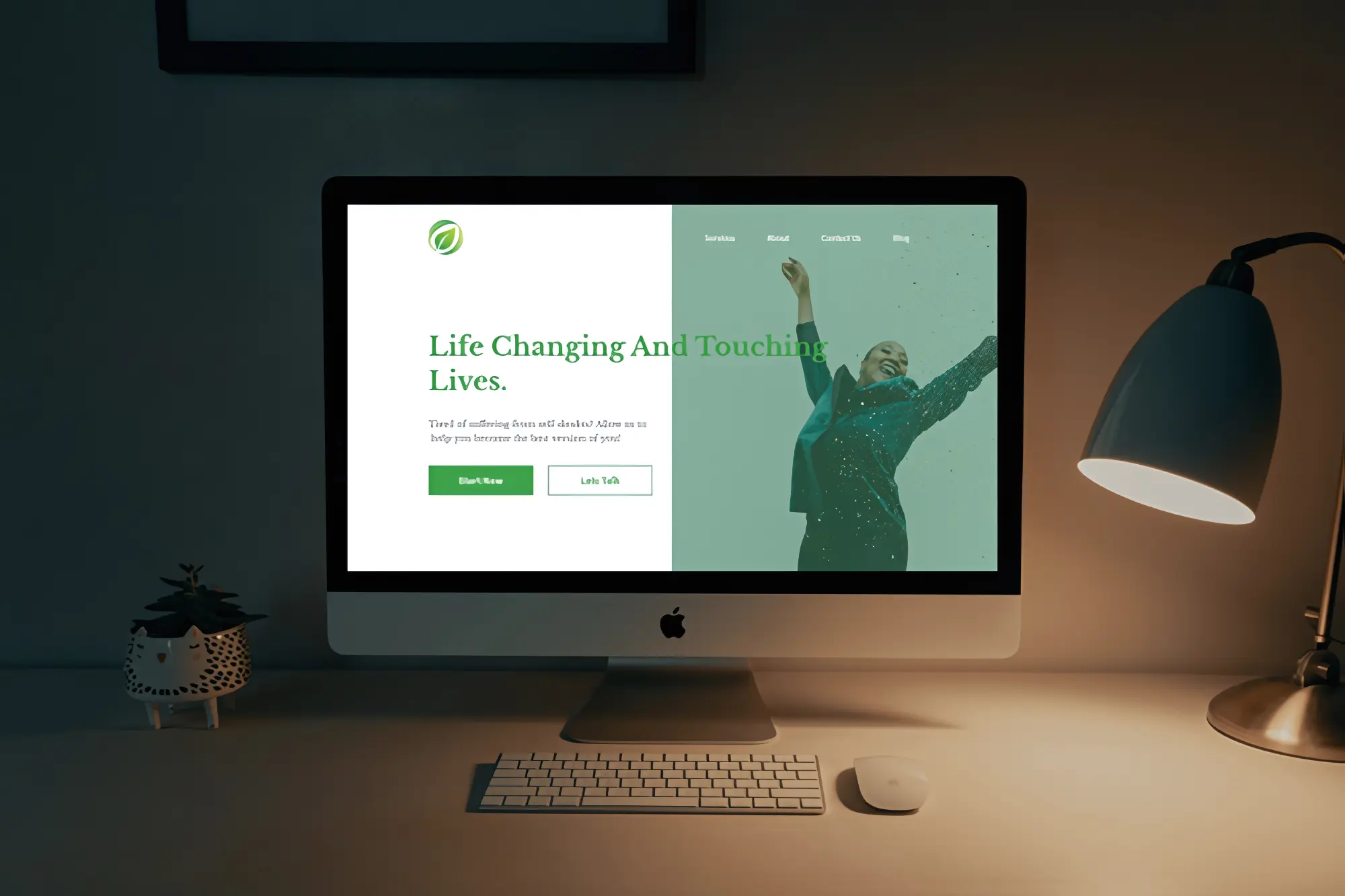
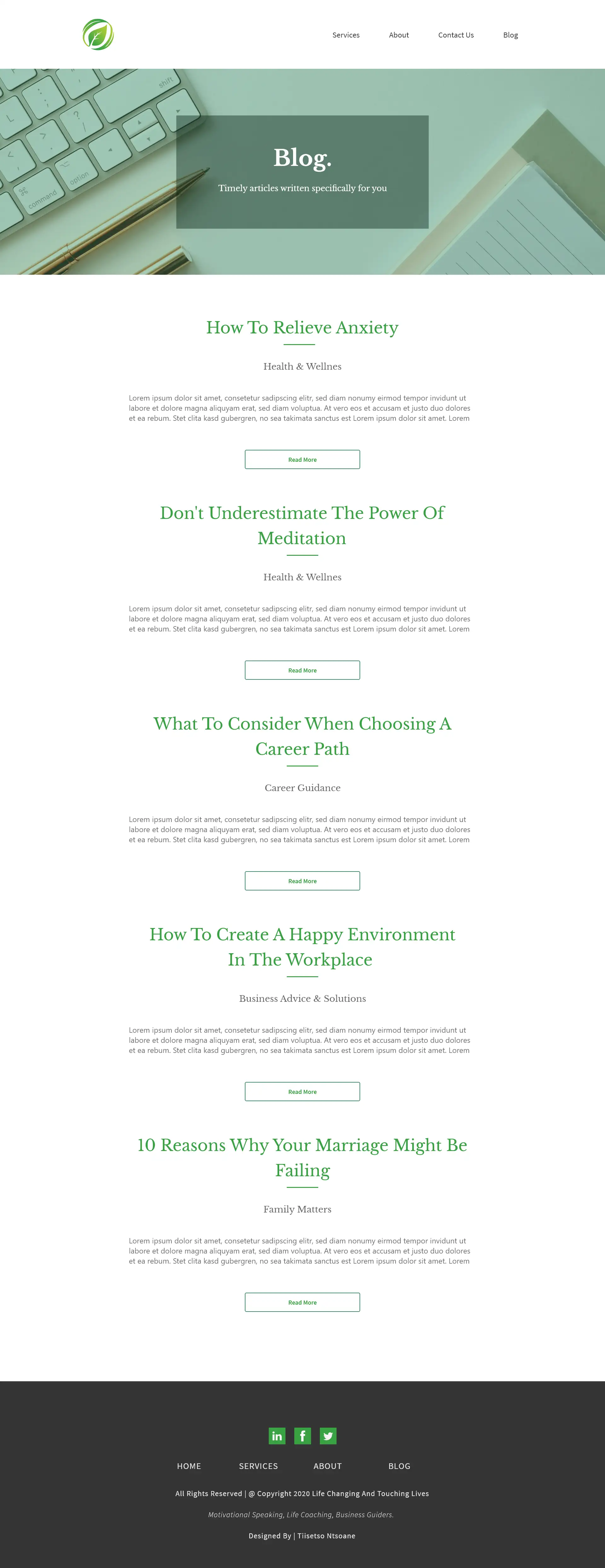
I undertook the development of a project titled "Life Changing And Touching Lives" for a client specializing in life coaching and counseling. The objective was to create a straightforward and visually appealing website that facilitates user bookings for counseling sessions. The website features a user-friendly contact form, allowing potential clients to submit session requests seamlessly. Additionally, there is a blog section that showcases the latest articles relevant to the client's collective work. Notably, the website is designed to be responsive and mobile-friendly, ensuring a smooth user experience across various devices.
See it live
Crafted for a life coaching and counseling client, 'Life Changing And Touching Lives' offers a simple, user-friendly interface for easy session bookings. This project prioritizes clarity and simplicity. With a responsive and mobile-friendly layout, it ensures a seamless experience for potential clients.
[ Layout Concept ]
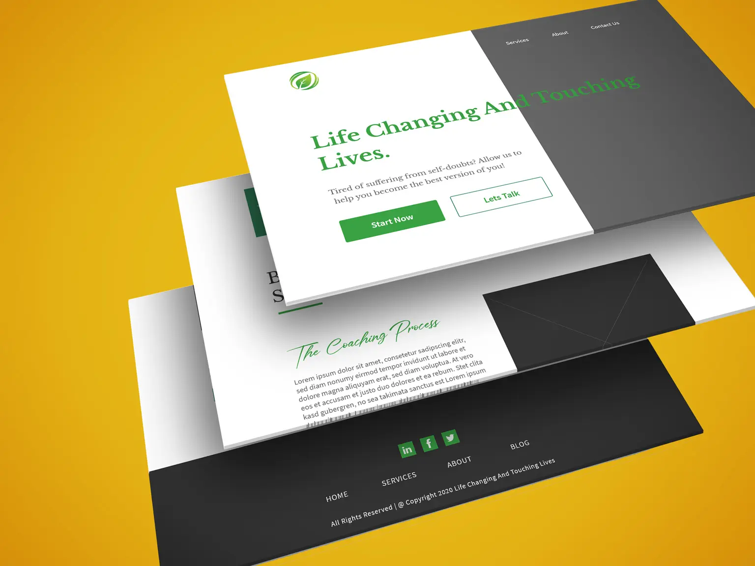
[ Landing Page Design ]
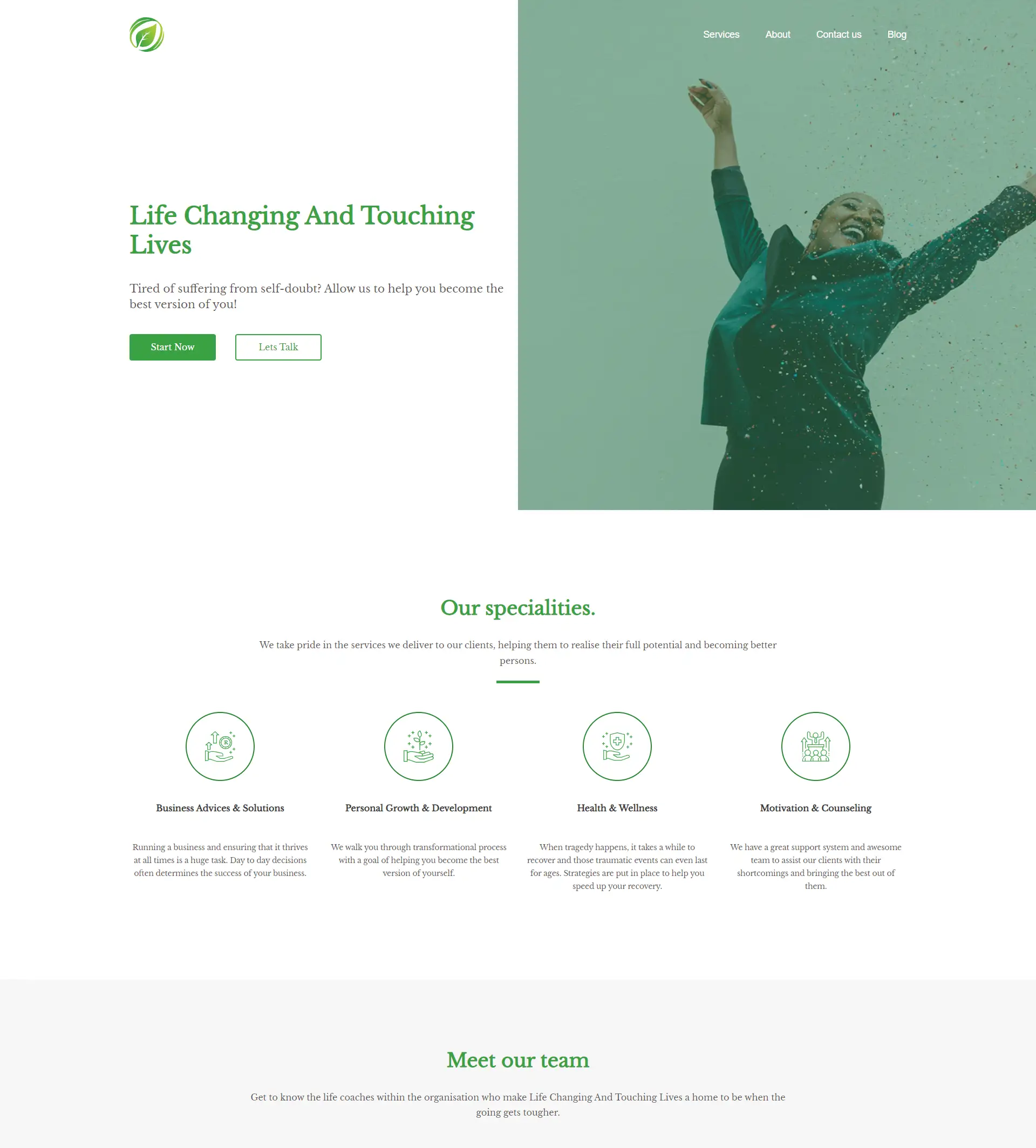
[ Services Page Design ]

[ About Page ]

The Design Strategy
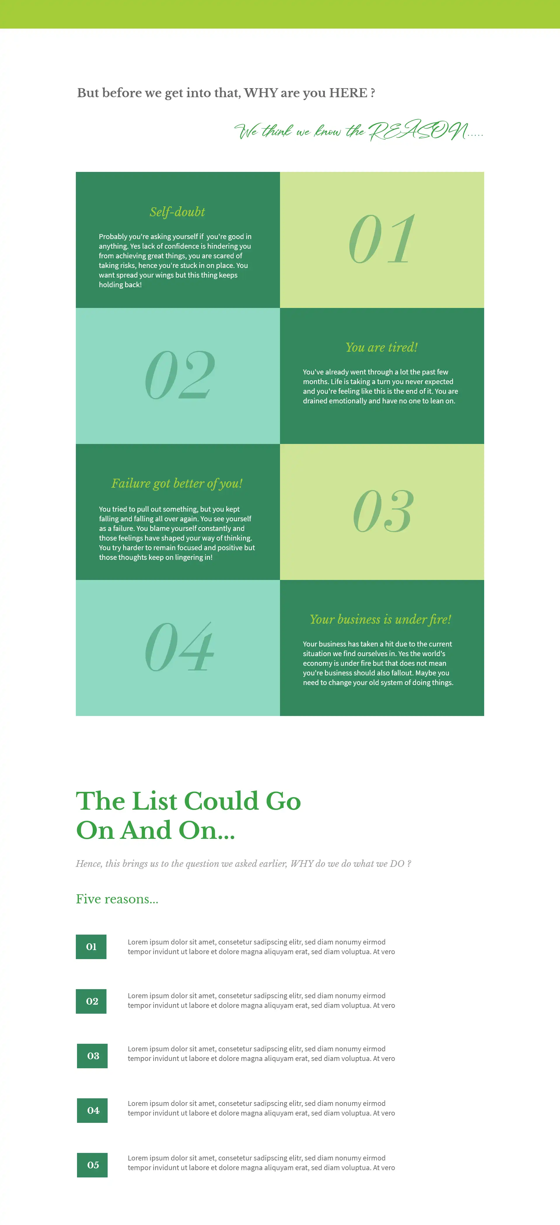
The strategy employed aimed at enticing visitors to immediately schedule a session upon their initial encounter with the hero section of the landing page. To accomplish this, I crafted a compelling headline designed to emotionally engage the visitor and instill confidence that they had indeed found the right place.
Given that the client provides services beyond coaching, I organized them in a sleek grid layout with minimal text. Throughout the site, a harmonious blend of green and greyish tones was used. The predominant use of green was intentional, symbolizing life and renewal, aligning seamlessly with the client's mission. Upon presenting this concept to the client, they not only appreciated it but also granted me the freedom to implement it.
The challenges
The challenge arose when incorporating a plethora of services offered by the client into the website while maintaining its distinct identity. The key question was how to seamlessly integrate this information without diluting the site's essence. The solution emerged in the form of condensing the information and prioritizing services that closely align with their core daily operations, centered around life coaching.
